Voor het project Zichtbaar slimmer, workshops datafysicalisatie en het vak HBO-ICT vak datavisualisatie zijn we op zoek gegaan naar interessante datafysicalisaties. Hiervoor hebben we een collectie van datafysicalisatie voorbeelden -het tastbaar maken van data- in kaart gebracht, waaronder een Information Physicalisation bord op Pinterest - https://www.pinterest.com/mekanis/information-physicalizationDeze bevat ook een Design canvas: Wat maakt een goede datafysicalisatie?Er blijkt namelijk veel behoefte aan voorbeelden om te helpen bij een beter begrip van datafysicalisatie en de praktische (ontwerp)aanpak.Datafysicalisatie draait om fysieke 3D representaties die je kunt beleven en aanraken, en gaat dus een stap verder dan datavisualisatie op plat 2D papier. Het tastbaar maken van informatie kan leiden tot meer inzicht (bijvoorbeeld hoeveel suikerklontjes er in bepaalde etenswaar zit), wat vervolgens weer kan leiden tot kritische discussie of gedragsverandering.
LINK
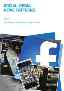
Wereldwijd onderzoek: Hoe gebruiken nieuwsmedia social media? Jongeren lezen geen krant meer, ze kijken op hun smartphone die ze altijd bij de hand hebben. Binnen het lectoraat social media en reputatiemanagement van NHL hogeschool te Leeuwarden heeft een groep internationale studenten in 12 landen onderzoek gedaan. Hierbij hebben ze meer dan 150 social media sites bestudeerd van nieuws media. De resultaten maken deel uit van een internationaal onderzoek van NHL Hogeschool en Haaga Helia University. De onderzoeksvraag was: Wat speelt zich af in de nieuwsmedia? Persbureaus kunnen het overzicht gebruiken om hun social media te optimaliseren. En voor ieder die journalistiek een warm hart toedraagt is het interessante informatie over de nieuwsmedia in een overgangssituatie (2nd edition)
DOCUMENT